It’s the juxtapositions that get you. A hot morning commute after the warmest May bank holiday on record, and the Central Line is sweltering. Opposite me is one of those women who is so striking you need to keep reminding yourself not to look too long to avoid creepiness. But it’s honestly hard to look away. She’s straight off a science fiction movie; pale skin, long black hair that is Japanese-straight, wearing tweed pattern linen trousers against the heat and a pale blue T-shirt with a pixelated picture of a glamorous black woman whose face is haloed by an enormous Afro. She has fine features that seem almost unnaturally symmetrical. But what’s really remarkable is her make up. Her small mouth is outlined in a metallic bronzy red. She has red eye shadow on her upper lids and black and grey eyeliner below. And around her eyes she has dabbed a pale gold blusher that comes down over the top of her wide cheekbones. She also has a smudge of gold on the tip of her nose; I resist the urge to lean over, tap her knee and ask if it’s deliberate. It would break the spell.
Two seats down is a tall middle-aged man, receding silver hair close-cropped to an iron fuzz and a neat salt-and-pepper beard with the pepper descending from both corners of his mouth. He wears angular metal frame glasses, of the type favoured by trendy architects. But he definitely isn’t an architect. I noticed before he sat down that he was wearing the full-length black cassock of a Catholic priest; immaculately pressed with every pleat in the skirt in place. A column of shining black buttons descends from the neat white rectangle of his dog collar. The immaculate look is spoiled only slightly by the yellow and black striped pencil clamped in the left-hand corner of his mouth, which he removes occasionally to make notes in the book he’s intently studying. Titled “The Mystery of the Eucharist”, it has the most bizarre cover styling I have ever seen: shocking pink, with the title in scrolling white calligraphy of the sort that would be more at home on a 1970s soft porn novel. Whatever the mysteries are, they are more enthralling than the figure from the future seated a few metres to his right, but then he’s made a vow about that.
Author: stulooksatthingsandwritesstuff
It is folly to be wise
It takes a certain amount of panache to wear a bowler hat. In these days where not many men wear hats at all, the formal styles are approaching extinction. And the bowler, with its connotations of finance and upper-class twittery most of all.
That hasn’t put this chap off.
The hat is sat very squarely on his head. It’s a slightly archaic style, with the brim rolled up on itself at the sides and projecting out straight to the front and back. It’s also not a typical colour; not a banker’s bowler in black, or a countrymen’s or rider’s protective headgear in brown, but an ash-grey affair with a paler dove grey band and binding around the edge of the brim.
The head it is sat on is middle-aged, distinguished and black. A black man in a bowler is remarkable indeed, and the wearer exudes the confidence to carry it off. It’s difficult to gauge his age; most of his hair – if he has hair – is covered, and the few inches exposed above his neck are cropped short, starting to grow back in iron-grey peppercorns. He looks focused and businesslike, attentive but not glancing around, intent on his own business in his business hat.
You can look at some black men and see their origins in the slant of cheekbones, the set of the eyes, the line of the chin and the dome of the forehead. The narrow, gracile bone structure of the Maasai, the broad strength of the Nubians. I can’t see that here, which although he is silent this makes me think he might be Caribbean; a mixture of African lineages, transplanted to the Americas.
I can see sensible, narrow-cut dark trousers and well-worn but sturdy brown lace up Oxford shoes, but the rest of his outfit is hidden under a voluminous kneelength raincoat: the type that can only be called a Mac. It’s a venerable garment, creased through years of wear, fading along the creases and shapeless, hanging from his shoulders like a bell. It’s fawn in colour, toning with the trim on the bowler although from the look of him, coordination was hardly a factor in getting dressed. This is all about utility.
His body language is just as notable as his outfit. He is standing by the double doors in the Tube carriage; feet firmly planted in a stance like a tai chi practitioner or a boxer: one foot facing forward, the other set at a slight angle. His knees are slightly flexed, and I can see the tension transferring his weight from the front foot to back foot through the tendons in his thighs. He’s surfing the train, keeping his balance against its lurches and shudders. He isn’t even holding on to a handrail: his right hand is pressed, tense but open, against the rail, which runs down his index finger, down his palm and to the heel of his hand. He keeps his upper body balanced by pressing and relaxing against the bar. And these compensations keep the bowler and static as the head of a hunting raptor as it quarters the fields below for its prey.
And he remains impassive. His eyes flicker across the platform as the train doors open, but don’t light on anybody or anything, giving the impression of seeing everything he needs to see. The expression does not change, the lips do not part, the eyebrows do not shift. As the crowd surges on, he turns to face down the carriage, keeping the hand pressed against the rail, now pointing with the fingers down, the feet shifting to a new sure anchorage.
It’s only when he crosses the carriage to get off at Holborn that I realise who and what he must be and where he is going. Russell Square is nearby, and as all readers of Ben Aaronovitch’s novels know, this is the address of the Folly, the 19th-century pile that is the headquarters of the followers of the more esoteric studies of Sir Isaac Newton; the Newtonian practioners; the Isaacs; the wizards. That Mac is concealing a long poacher’s pocket in its lining, containing a twisted steel pole at the core of an oaken staff that stores his power. The wizards help uphold the Queen’s peace; they used to be Army but are members of the Metropolitan Police, the few survivors of an apocalyptic battle in the forests of Germany in the 1940s. Since then, some survivors have been ageing backwards, so there is no way of knowing how old this gent might be. But he is surely on the way to a debriefing session with his superior officer, DCI Thomas Nightingale. Officially, Nightingale would be his Master, but he is a gentleman, a Mensch and a Tzadik. Sensitive to the connotations of the title Master, he is quite happy to be called Guv.
Gors fawr
Not really an art piece, but it belongs here more than in the people section.
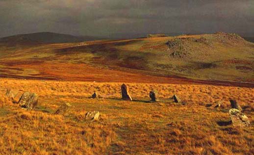
The air feels like it’s been baked, but the stones don’t care. They’ve been here too long and seem too much, and besides, they are lumps of mineral and don’t have emotions.
Visually, the circle isn’t particularly impressive. This is no heroic Stonehenge, epic Avebury or breathtaking Callanish. The circle is not actually a circle but egg-shaped, and no more than about 25 feet across. The stones themselves are small, even stumpy; some are level with the ground, though whether hacked off or sunk is impossible to tell. Most are less than a foot high, and the two tallest are the height of a small stool, though not flat at the top and therefore impossible sit on; but they stand in shallow depressions which show that many people have rested against them with their feet outstretched.
How many people? Again, impossible to say. Three and a half millennia these stones have stood here; that’s a lot of people, a lot of bottoms, and nearly twice as many feet.
This is the Preseli Hills, where the bluestones of Stonehenge came from. But these aren’t bluestone. I’ve seen bluestone only a couple of days ago, not far from here, up on the ridge at the great chambered tomb of Pentre Ifan. That improbable monument stands in a spacious field, and just at the gate where you enter are two pieces of bluestone set into a bank. They are flush with the grass, and once again impossible to say whether a natural outcropping or placed there, but they are quite obvious. Bluestone is strange, unearthly stuff. Those stones are smooth and glossy, and the eerie colour of the air at dawn or a pale Common Blue butterfly, and almost metallic looking. It’s like the stone is covered with a thin transparent film and the colour comes from some depth below the surface. Unmistakably a mineral, inorganic colour.
But the stones in this circle are grey, patched with pale lichen that has accreted over the centuries in the clean air. They don’t look like they are worked, there is no sign of a square corner or a flattened face, but they must have been. At one point, these were part of the earth, and somebody freed them, whether cleaving them along existing cracks or chiselling them from a hillside, and brought them here. Placed them deliberately.
Like with all of these sites, it’s not really the stones themselves are important, but the landscape in which they are placed. Hold out one of your hands and cup It with the fingers tensed. Now lifted to eye level and ignore the fingers, just focus on the flesh of the palm and how it rises and falls in hills and valleys around the depression in the centre. The land here holds the stones just like that. On the horizon, the hills role and fade in gentle waves, a hummock here, a whaleback shape breaching after the next dip. The most marked feature is a nearly hemispherical hill crowned with a spiky outcrop of rocks. In line with that stand two outlying stones, actually larger by far than any stone in the circle.
The circle stands on a slight flattened rise, and walking from this plateau towards the crowned hill and its marking menhirs it becomes obvious there is a small avenue, a cursus: the other stones fallen, sunk or levelled but still clear. This was a route that was walked. The crowned hill must have had meaning.
The ground here is soft and difficult to walk on, despite the heat of the past weeks which has left other earth hardened and cracked. Grass still grows thickly, although it has faded to a dusty greenish dun colour, and spiky clumps of some hardy vegetation are interspersed with the shiny lobed nuggets of sheep shit. There are patches of gorse, although low and not bushy. The softness of the ground is due to a thick layer of sphagnum moss, so dry there is a noticeable crunching feeling as you step on it. Under normal conditions in south Wales – that is to say, frequently raining – the moss would soak up vast quantities of rainfall and your feet would be in pools of muddy standing water. But not now, in this unusual July furnace.
Although it’s unspectacular, there is a particular atmosphere here. It reminds me of being in a cathedral, but not because it’s peaceful. It isn’t peaceful; two stonechats are yelling at each other harshly, and although the nearby road is quiet, there is a definite hum of traffic. But cathedrals aren’t peaceful either. They never have been. Today, there is the inescapable bustle of tourists; in times past the constant business of worship. But there is a heaviness to them, inside, as though somewhere there is a definite mass whose gravitational effect slows down time in its vicinity. Time feels slower here, too. It isn’t haunted. The spirits of whoever made this place and aligned it with in its landscape are not here; although someone has been. Despite the notices banning fires, a blackened patch in the middle of the stones shows that some idiot pagans thought it would be a good idea to light a fire in the middle of all this tinder-dry vegetation. Lucky the whole lot didn’t go up. What feeling here is generated purely by the rise and fall of the land, the way the air sits in its folds and moves through its channels. It puts a quietness on you. This unnatural intrusion makes it feel all the more natural. Perhaps that’s the point after all.
Luminous fog
I wrote this piece after going to see the play Red about Mark Rothko. The title comes from a phrase the art critic Waldemar Januszczak used to describe Rothko’s work.

You can’t understand Mark Rothko’s work until you get close to it. From a distance, it appears to confirm some of the worst assumptions about modern art, particularly abstract art: it’s simple blobs of colour; it took no talent to make; it doesn’t mean anything; a child could do it.
And then you get up close.
The first thing you realise is that the colours aren’t solid; there are variations in tone all across the works. Overall the same colour, certainly, but no more uniform than a face is uniformly pink or brown. The second thing is just how densely worked the paint is. The brushstrokes are visible; and they don’t just go in one direction. Rothko’s brush was busy across this surface, backwards and forwards, up and down, diagonally. The only forms of motion not represented are curves and swirls. This is carefully considered painting. They look the way they do precisely because Rothko consciously intended them to look like that. The brush marks are loose, certainly, but so were Rembrandt’s. So were Van Gogh’s. So were Turner’s.
And then you look at where the colours change. The meticulous blending of one colour into another. It’s exquisite, and as subtle as the variation in tone on any Old Master. These are no thoughtless daubs; this is real technique at work.
The effect of standing in front of a Rothko is difficult to describe. Back when I visited the Tate as a schoolboy, my art teacher said “just stand in front of a whole block of red, so that you can’t see anything else. Think about what it feels like to just be able to see red.” But you can’t do that. That’s when you realise that the size of these paintings was just as carefully considered as their surfaces. No matter how close you get, you can still see other colours in your peripheral vision. It can only be deliberate.
Rothko was playing sensory tricks. As he was a studious man, I can only imagine that he had researched what was known about the way that eyes work and tailored his art accordingly. Human eyes have not evolved to stare at one thing. The visual sense works by detecting boundaries and movement. That is why your eyes move all the time; the fastest muscular movement in anybody’s body. They constantly flicker and rove, seeking out differences all the time; and if they stop moving, you stop seeing. Rothko must have known that his viewers would not be able to their eyes flicking over his colour boundaries, again and again. He must also have known that we instinctively see patterns and familiarity, even when we aren’t looking for them. His paintings look like windows and doorways because he knew that’s what we’d see in his simple designs.
So we are meant to feel drawn in to these paintings. We are meant to feel like we are moving towards them, drifting into some new space. And because Rothko, undoubtedly a bit of a control freak, also specified the height at which his pictures were to be hung, we are meant to feel drawn upwards. Perhaps that’s why so many people feel that they have a spiritual quality.
What this means, of course, is that there is no point whatsoever in looking at a Rothko in reproduction. It’s all about the effect of the actual artwork. It overwhelms your senses because it is supposed to. And sitting in a room full of Rothkos is going to be disorienting and profound. That’s exactly what he wanted to happen.
What on earth possessed this meticulous, thoughtful control freak to accept a commission to paint murals for the most expensive restaurant in New York City? Who did he think was going to be in that space, and why? Considering his eventual suicide, was this an act of setting himself up to fail, the first part of his self-destruction?
Rothko rooms are chapels by any definition of the word. They are spaces for introspection where there should not be any other distractions. I’ve never been to the actual Rothko Chapel, with its huge black and indigo panels, but I can’t imagine it’s a happy experience. The Seagram room at Tate Modern certainly isn’t. The panels are the colours of dried blood, and the feeling of being surrounded by them is biological and visceral. It’s not something I can face easily even if I want to.
I think what my teacher (whose name was Ian Ferguson) was getting at is that there is something synaesthetic about standing in front of a Rothko. With your visual sense overloaded, it starts to spill over into other senses. What does it feel like to be standing in front of a field of red? It feels like a buzzing. The colour pulsates, and you know it’s a trick: it’s the effect of the boundary between colours and the way your brain processes that. But knowing that doesn’t stop it happening.
Visiting an exhibition of some of his other works revealed that is not just sound that crosses over with these works. Some of his brighter pieces – oranges and greens, sunny yellows and serene blues – trigger an emotional response. Cheerful, relaxed, energised. The acid green creates a zingy taste along the sides of the tongue, even a phantom smell. I sometimes get the same feelings looking at El Greco, possibly why I find some of his work so uncomfortable to look at. Klimt is another one, with his fields of gold and flesh. I’ve never seen a real Klimt.
It’s a total art, and it’s unlike anything else. Immersive art and virtual reality before the terms were even dreamed of. Art of the senses. What a legacy.
Artefacts and arty facts
This is the first art piece I wrote. I was just blown away by the Holbein in England exhbition at Tate Britain in 2006, and needed to write something. I think I was in a mood on Monday morning and needed to warm up. Continue reading
Make youself comfy
This is a blog to collect all my non-journalism writing (although I might archive some journalism too). The very Ronseal title is courtesy of Miranda Brennan, who said she’d happily read more ‘Stu looks at things’ stuff.
At the moment, there are two sorts of things here: writimg about people I see on the Tube, and writing about museums and galleries. I’ve been rescuing stuff off of my old Livejournal if it seemed worth keeping.
Good company in a journey makes the way seem shorter. — Izaak Walton
